Munchkin - Kids' Recipe App
Goal: To design a recipe mobile app that is user-centered, by focusing on both, UX and UI design processes. For
UX, the process involved competitive analysis
and user research, creating user personas, defining MVP and user stories, designing a user flow, creating paper
prototypes and usability testing. The UI design
process included creating mood boards, wireframing, running preference tests, building a responsive design,
mockups, creating a style guide, and user testing.

Easy, delicious, and healthy recipes for your kids!
Summary:
I created Munchkin, a specialized recipe app that aims to provide quick, easy, and fun recipes for kids. It is
designed to primarily help working and stay at home parents plan meals, share, and
have access to delicious and healthy recipes at their fingertips.
Problem:
Working or stay-at-home parents today have to rely on either takeout or processed, packaged food as they do not
have time to cook or even think about simple and quick recipes they can make. For
children with dietary restrictions or allergies, the scope of possible recipes becomes even narrower.
Goal:
To create a time effective, simple-to-use and -navigate platform, that parents find useful for planning their
children’s meals.
Target Audience:
Working or stay-at-home parents, child care centers,
parents wanting to cook traditional recipes.
PROCESS - USER RESEARCH
I started by gathering information about potential users and their needs by following the Research Learning
Spiral (RLS) process. This involved defining the research objective, developing a
hypothesis, using research methods like interviews and surveys, and finally synthesizing
the findings to understand user requirements.
Pain Points that surfaced:
- Time and energy are a major factor in cooking habits
- Limited meal ideas lead to eating packaged or outside food
- Web searches are more frequently used compared to a recipe app
- Need a way to monitor child’s diet, plan meals, and keep track of supplies - Difficult to find trusted recipes
Potential Solutions:
- Offer quick and easy recipes that are trusted, healthy, and nutritious.
- Provide option to scan bar codes on items or manually enter item names
- Filter recipes based on time, ingredients, nutritional value
- Provide a platform for parents to share and discuss recipes, and experiences
- Option to filter recipes based on the kids diet and needs by creating a profile
- Be able to monitor child’s nutrition and save recipes
- Add recipes to meal plan, and ingredients to the shopping list from the recipe page - Way to share shopping list for convenience
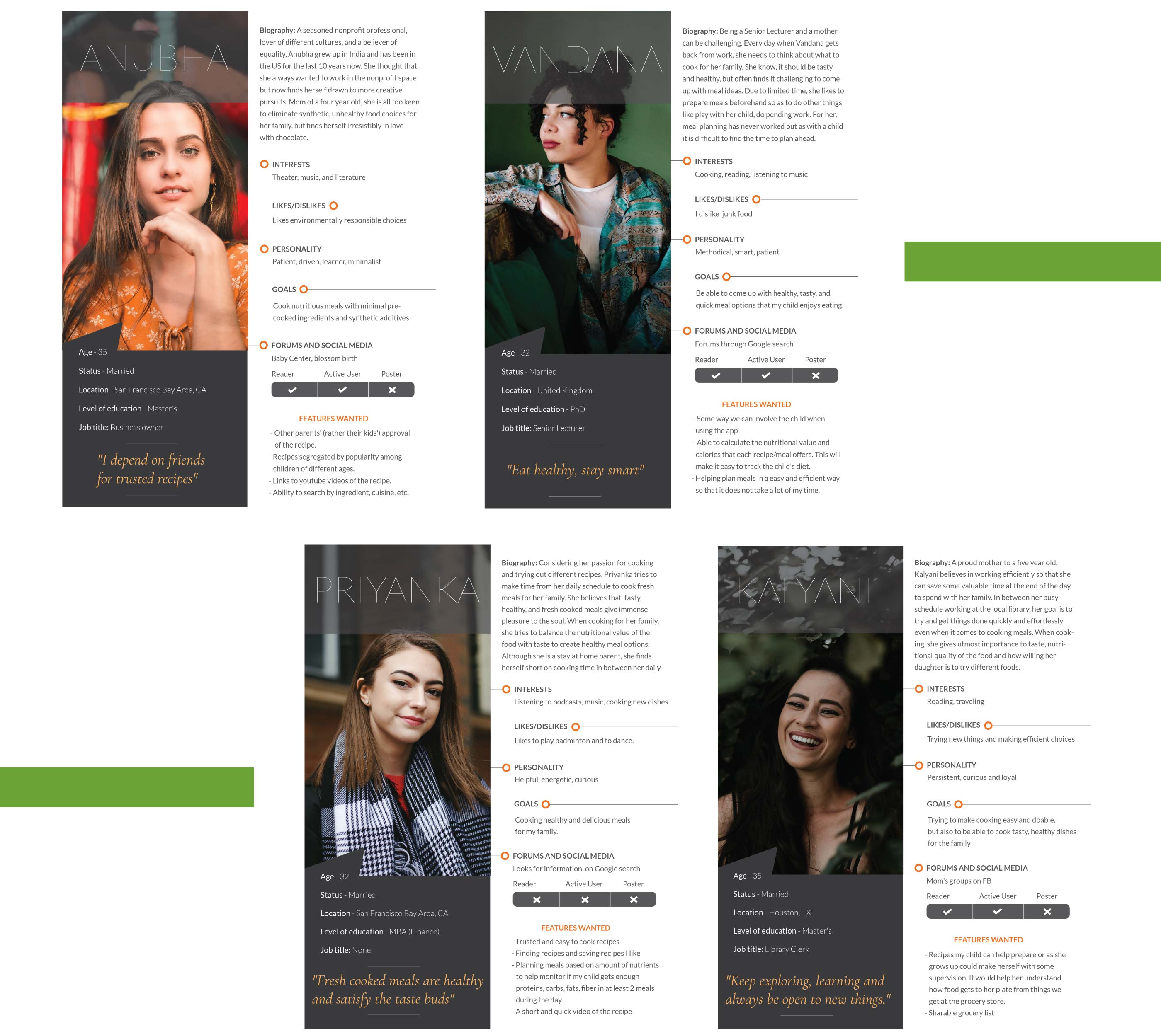
User Personas:
Based on emerging patterns and similarities of users during my research, I created 4 personas to further
understand user behavior, needs, and wants. The personas reflect users’ demographics, biography,
interests, personality, goals, any forums or social media used, and important features
to be included. In conclusion, I observed that the users follow
a busy lifestyle, and aim to be efficient in cooking to enjoy some quality time with their family.
Key Performance Indicators (KPIs) chosen:
- Usage - Sliced by location, preferred language, preferred cuisine(s), free time available, and inferred information such as household income, education level, can help define the userbase
- Time on Task - Provide easy access to features and reduce the cognitive load on the user
- Overall Satisfaction - App reviews and ratings on app stores will help improve user experience
- Task Success Rate - Learning about abandonment rate per step of the task, time spent per step, any loading errors or other software problems, task exit path helps understand where users had the most difficulty
- Engagement/Active Users - Tracking daily and monthly active user numbers as a percentage of installs will measure how much the app is a part of users’ daily life. Studying features used the most by the most active users can help prioritize future product direction.
Features defined for the MVP based on the user stories:
- Search and Filter - Search for recipes and filter search results
- Recipe List - The main feature of the app will be a list of suggested recipes for the user
- Recipe Details, Steps and Ingredients - As the user explores a specific recipe, they will look for information like nutritional value, food type, serving size, cooking time, and ingredients used, to get an idea of what each recipe has to offer.
- Sign Up - Creating an account will make the app experience more customized and personal.
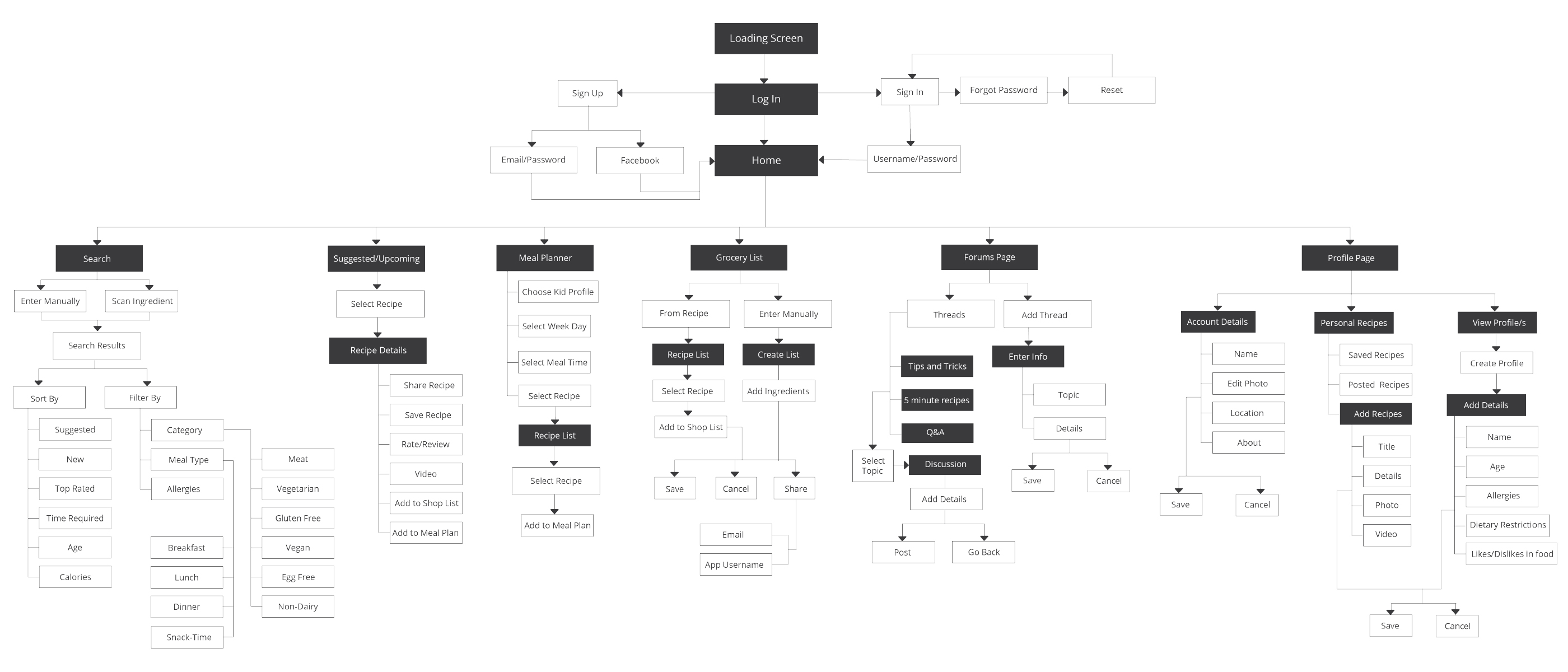
User Stories and User Flow:
My users value saving time and conveniently accessing recipes tailored to their preferences. These factors
informed my most important user stories, which I then developed into the user flow seen below. The main
features I included are: recipe list, meal planner, shopping list, forums, profile and search.
PROCESS - USER INTERFACE DESIGN
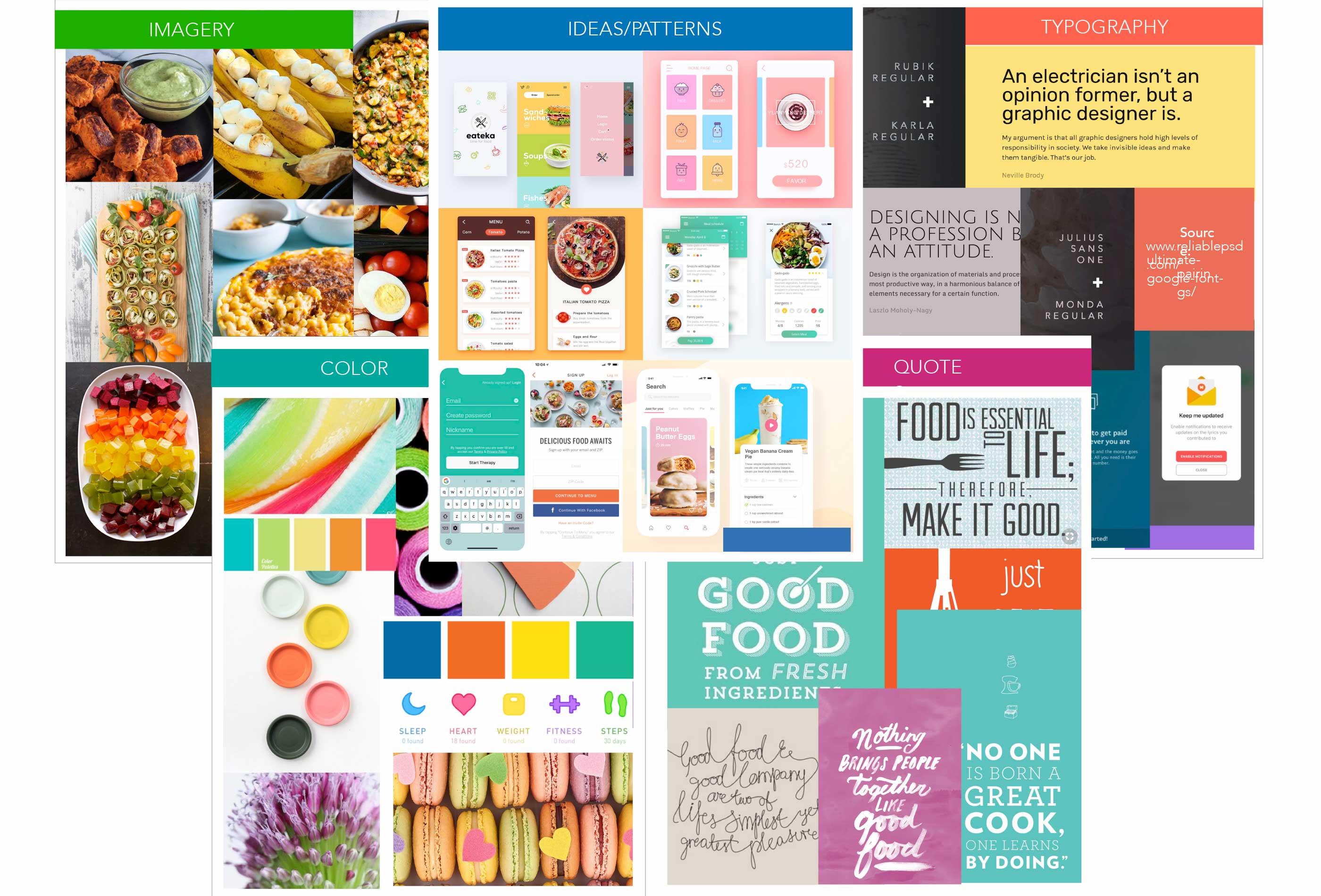
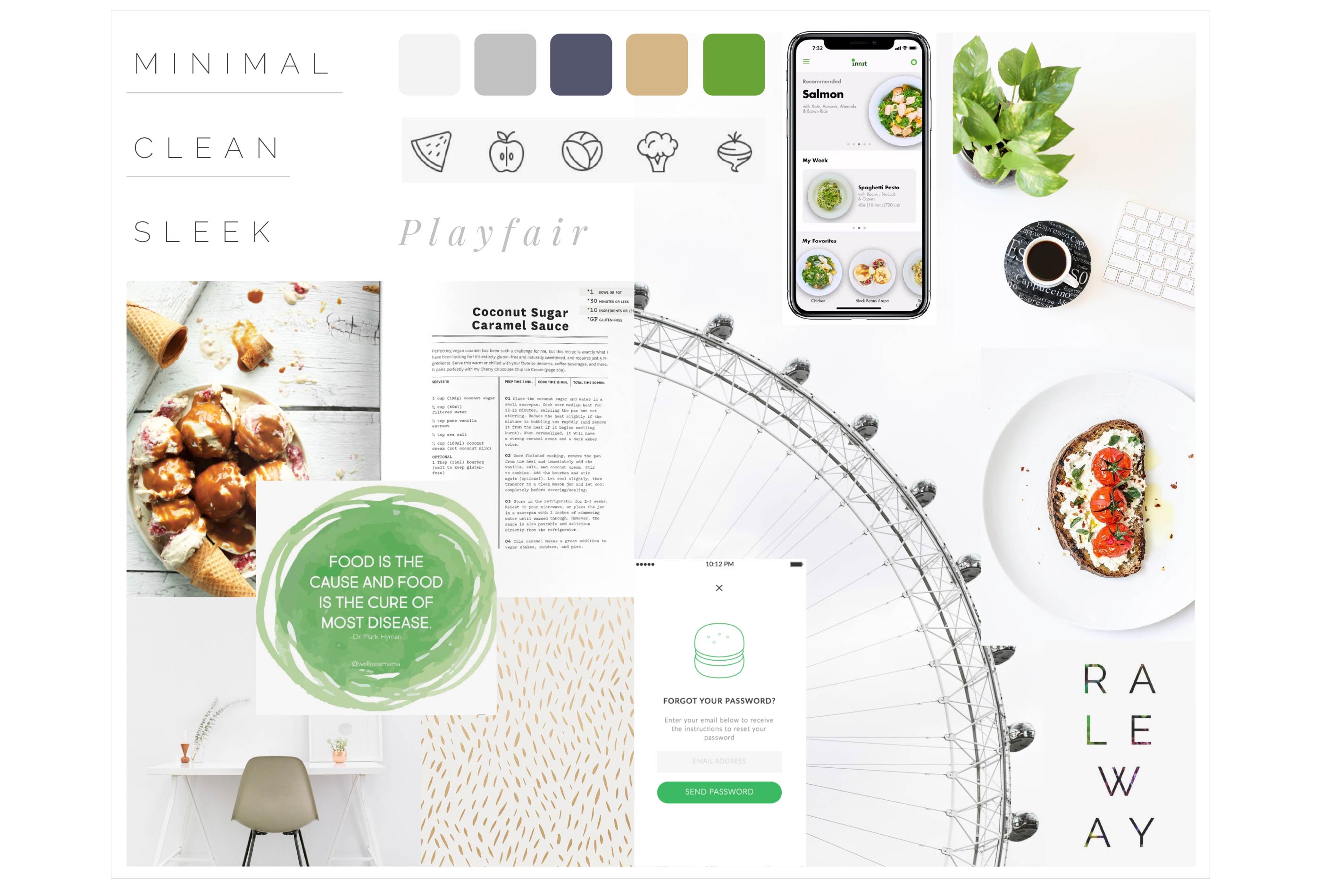
Inspiration and Mood Boards:
After creating the user flow, I started putting together inspirational material that closely reflected the mood
and direction of my app. I wanted the app to look clean, sleek, minimalistic, and simple. The color palette is
a
perfect balance of bright and bold hues like green and blue, and muted greys that add simplicity to the look
and
feel.
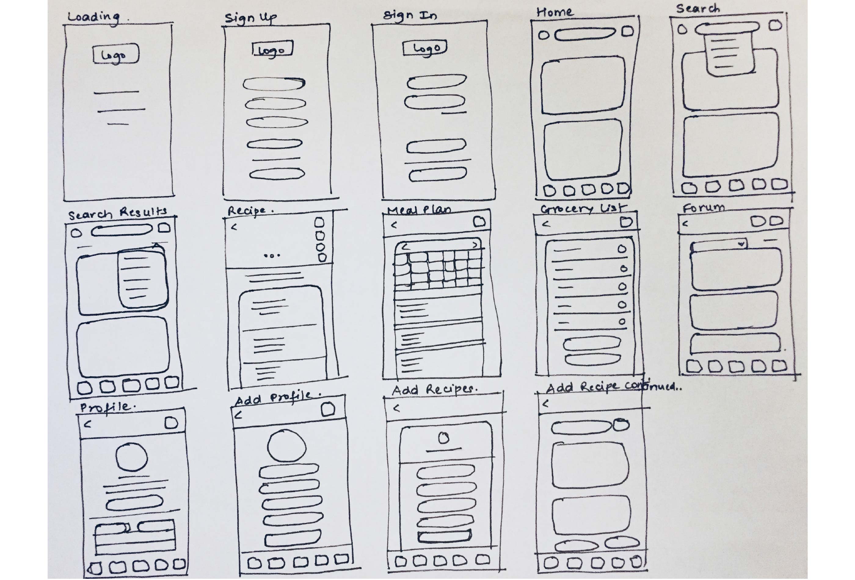
Wireframes and User Testing:
At this stage, I first sketched out low-fidelity wireframes based on the user flow diagram. I chose a few user
stories to work with and created rough sketches of the UI for iPhone 8 using pen and paper.
The screens displayed the various stages for the user to get from point A to point B. I tested
these initial sketches with potential users to gain feedback on the funcationality, usability,
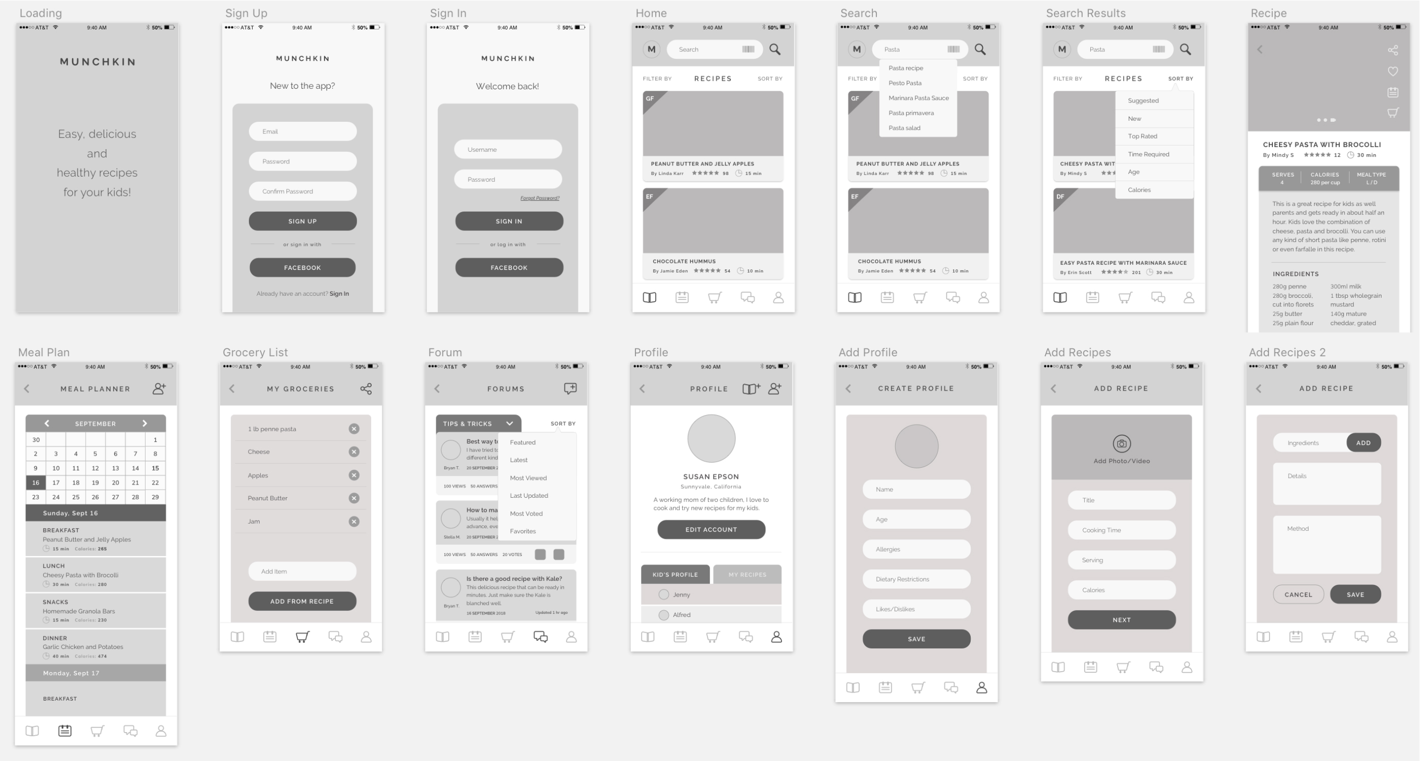
and navigation of the app. Based on feedback, and after a few iterations, I
designed the mid and high-fidelity wireframes in Sketch, While working on these
wireframes, I followed the iOS Human Interface Guidelines and used grids for precision.
Further, I shared the high-fidelity designs with potential users, as well as other
designers to make sure the design and flow of the app had no usability issues. There were some cosmetic
errors, which I fixed and refined to create a polished UI.
LOW-FIDELITY WIREFRAMES
HIGH-FIDELITY WIREFRAMES
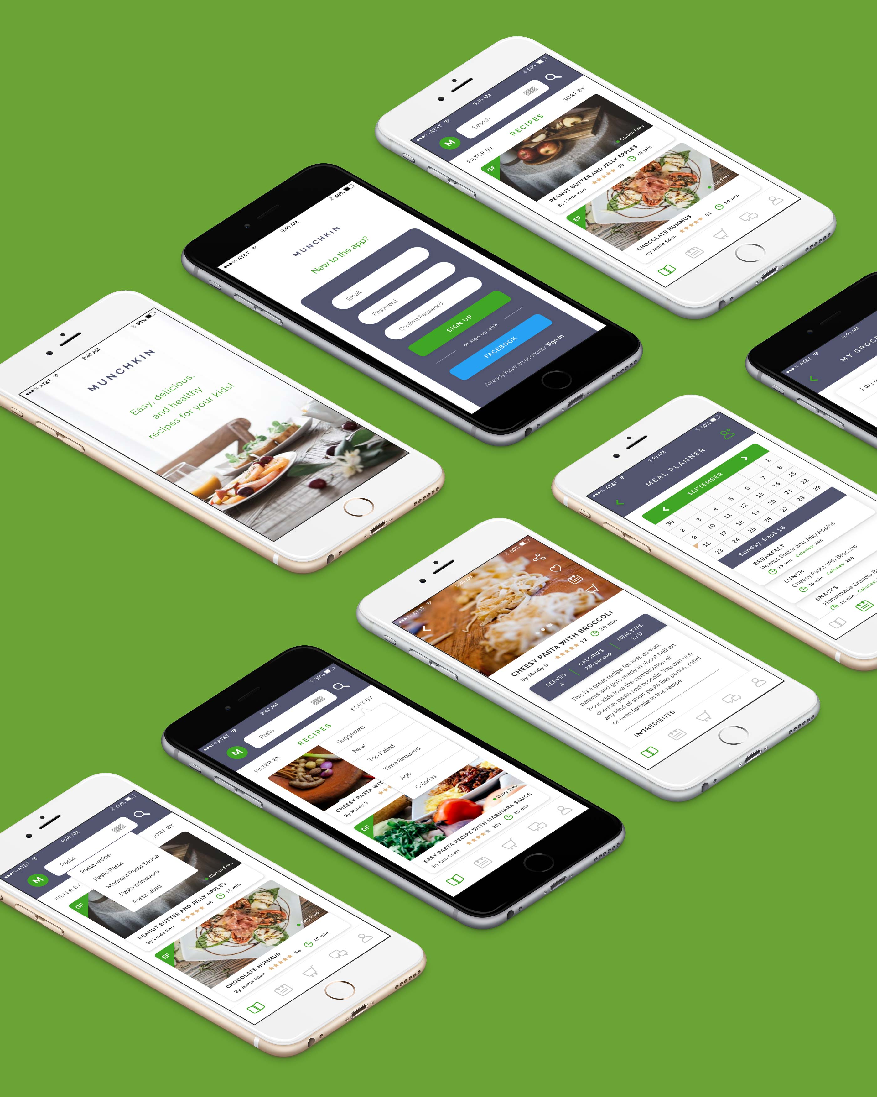
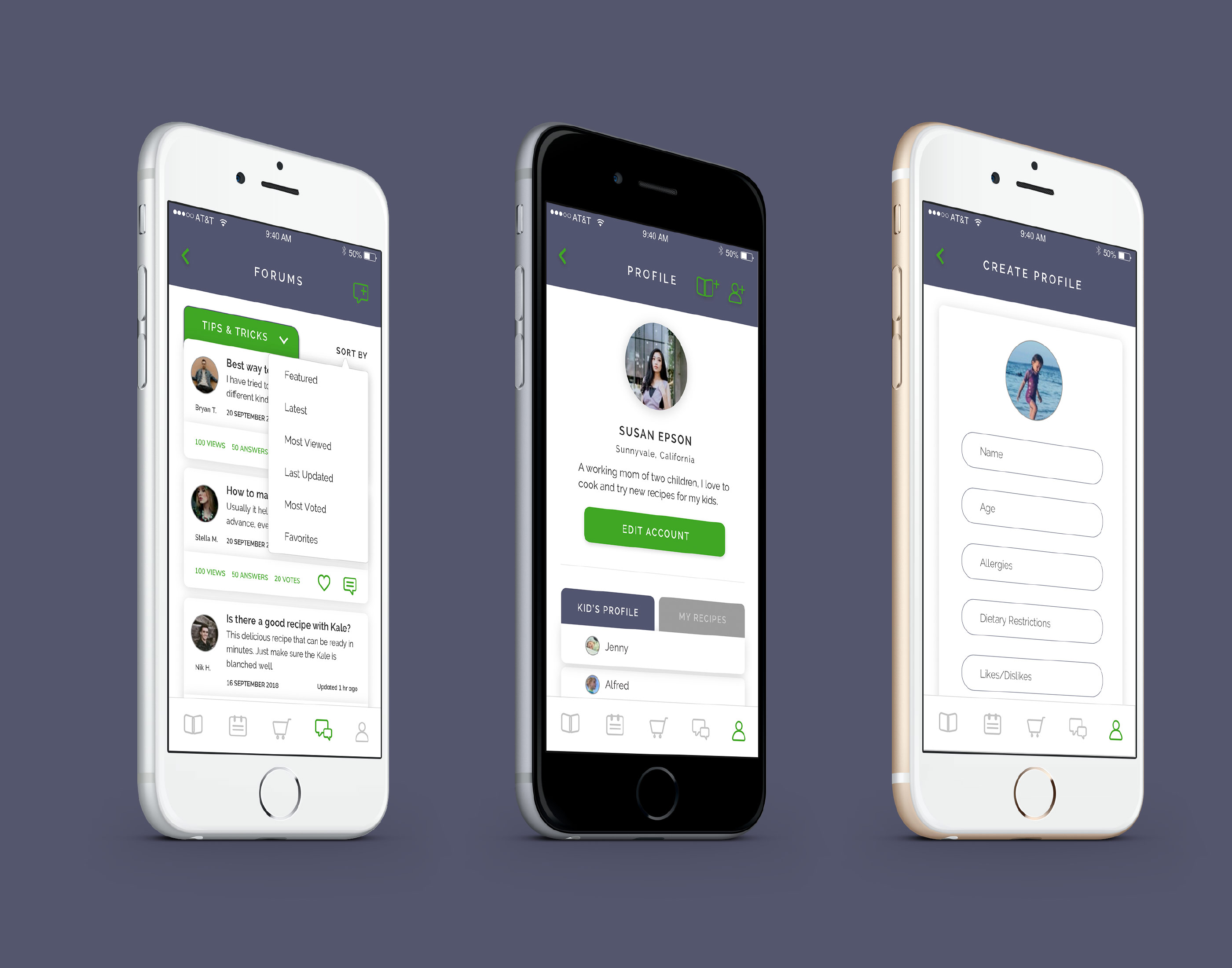
Final Product:
After nailing down the high-fidelity wireframes, I started polishing the UI for my app in Sketch by adding
details like icons, colors, images, text, buttons and other elements. I tried
to ensure every screen was cohesive, and took into consideration users’ probable
gestures and actions throughout the navigation.
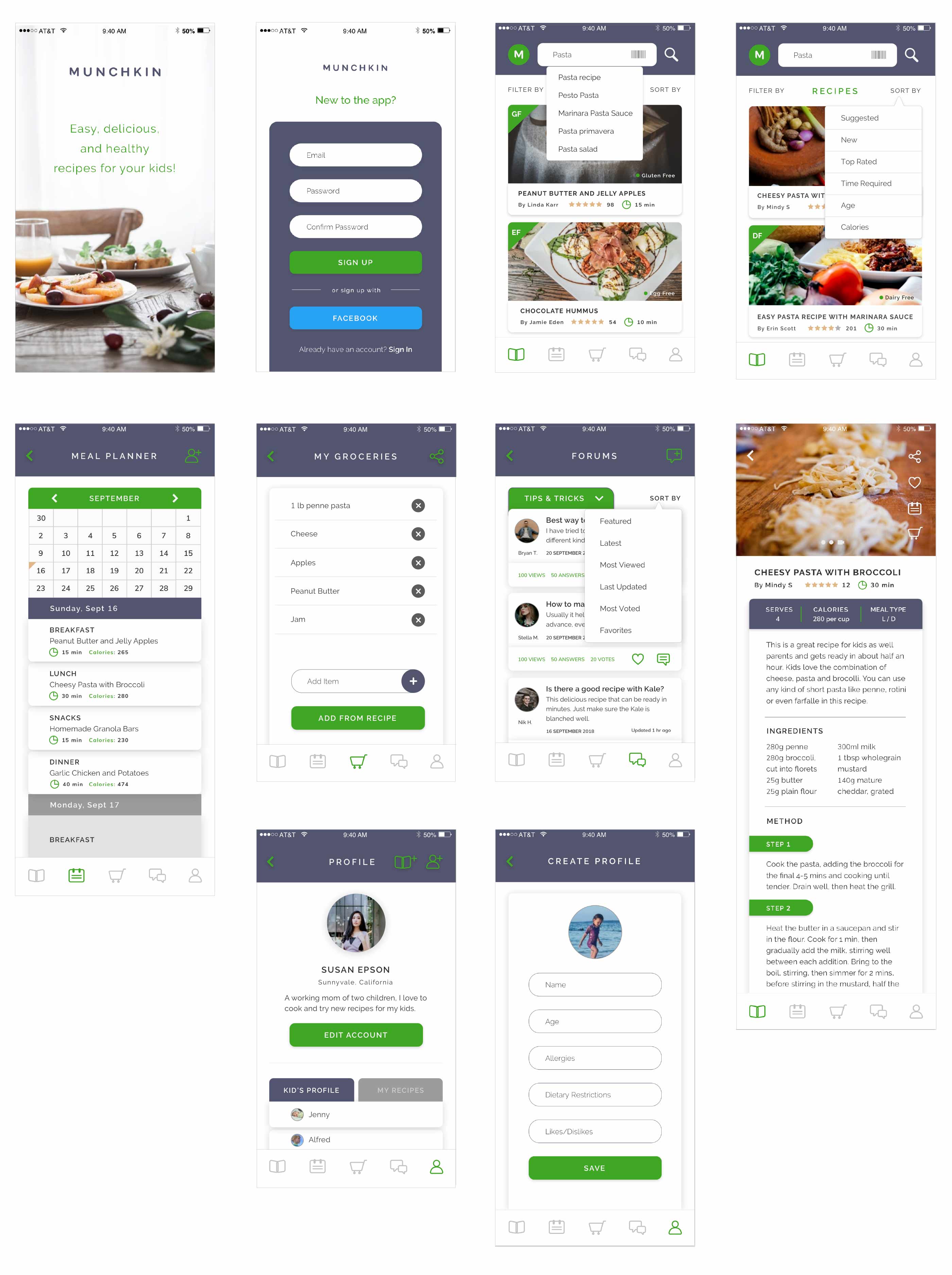
Mockups:
Project Retrospective:
What went well?
Sharing ideas and designs early on with the users, during user testing, helped surface some valuable questions
and possible problems that would have otherwise gone unnoticed. This helped in
creating a user-centered design accounting to a better user experience.
What didn’t go well?
The users I interviewed did not represent a diverse group - in terms of race, gender, family size, age, income
level. I may have gotten different types of feedback if my pool of
interviewees was larger or more diverse.
What can be improved?
Color palette could have been more child-friendly - A common request from users was to enable the child to be
involved in planning their own meals. My minimalist design and color palette would
perhaps not appeal to children or interest them in using the app.